

What Your Features Aren’t Telling You?
Understand a feature, test it, analyze it... It's not a luxury. It's the foundation!

There’s one question I always ask myself before adding a feature to a model:
Does this feature actually tell me something about the label?
It’s easy to stack “interesting” features. They look good, you’ve seen them used before, and you think, why not?
But in reality, a lot of them have zero meaningful relationship with what you’re trying to predict.
In this newsletter, I’ll show you a simple way to visually test if a feature impacts your target, no model, no cross-validation, just some logic.
It won’t replace a full validation pipeline, but it’s a great first step to clean up your features.
Let’s get into it.
1. What's the idea?
Let’s say you have a feature: volatility, skewness, RSI, whatever.
You’re trying to predict a label: maybe price direction (up/down), volatility regime, or some other classification.
If your feature is useful, then the distribution of the label should change as the feature increases.
One simple way to test that?
Take your feature, compute its percentiles from 1 to 100, and for each threshold, keep only the samples where the feature is above that percentile.
Then, check how the distribution of the label changes.
If the feature has no relationship with the target, the class distribution should stay roughly the same across all percentiles.
But if the feature is informative, you’ll start to see clear shifts, maybe class +1 appears more often as the feature grows, or class -1 disappears.
This isn’t magic. It’s not even a model.
But it’s a powerful way to answer a simple question:
“When this feature increases, does something change in the label?”
2. Percentile-Based Analysis: When Correlation Isn’t Enough
Sometimes, a feature has close to zero correlation with your target, yet still carries valuable information. Other times, that zero correlation reflects actual irrelevance.
A simple way to dig deeper is to plot how the distribution of your target class changes as the feature increases.
One method: iterate over percentile thresholds from 0 to 100, and compute the percentage of class 1 values above each threshold.
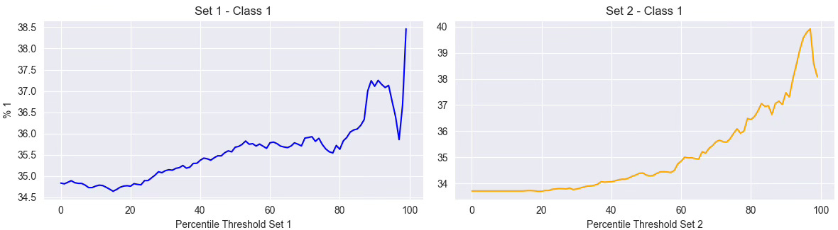
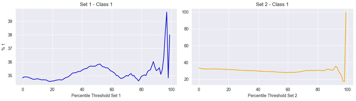
Let’s take two examples. To add a little more robustness, we just split our data in two sets.
Feature 1: Volatility Feature
In the first graph, we analyze a volatility feature. Even though its raw correlation with the label is close to zero, we clearly see a pattern: the higher the volatility (above 70–80 percentile), the higher the proportion of class 1 trades. This suggests a non-linear relationship: volatility matters.
Feature 2: P-Value of a Statistical Test
In the second example, we evaluate a feature based on the p-value of a statistical test (like ARCH test). Here, the correlation is also near zero, but this time, the graph confirms it. The curve is erratic, with no clear upward or downward trend. That doesn’t mean the feature is useless, but it casts doubt on its direct usefulness for the current label.
Conclusion
This kind of percentile scan doesn’t prove anything by itself, but it helps validate your intuition. Volatility might not correlate linearly with the target, yet, high volatility could still signal different market regimes that affect outcomes.
It’s not about discarding features based on correlation. It’s about understanding how they behave across the spectrum.
3. From Percentiles to Decisions
So, what do you actually do with these percentile plots?
They’re not meant to replace statistical tests or feature selection pipelines. But they give you a visual intuition that’s often missing from pure correlation scores or feature importance charts.
If the curve shows a clean, monotonic trend, like we saw with volatility, it’s a good sign the feature carries signal, even if traditional metrics didn’t pick it up. You might keep it, transform it, or use it to trigger specific regimes.
If the curve is flat or chaotic, like the p-value example, that doesn’t mean the feature is useless, but it raises doubts. At the very least, it shouldn’t be treated as a key input without more investigation.
Sometimes, seeing the shape of the relationship says more than any single number.
If you want to go deeper, build smarter features, understand signal reliability, and master techniques like triple-barrier labeling, model understanding, or feature conditioning, that’s exactly what we cover in ML4Trading.
🚀 Whether you're coding your first models or scaling a live strategy, ML4Trading gives you the tools, templates, and theory to build robust and intelligent trading systems.
Thanks for reading, now it’s your turn to build the brain of your strategy.
Nice read!
Is this functionality in the Quantreo library?