

The Clip Effect: Is Your Backtest Real, or Just Lucky?
A 60-second robustness check that kills most backtests.

You ran a grid search. Lookback = 20 gives you a Sharpe of 2.1. You smile. You start writing the strategy doc.
Then you check 19 and 21. Both at 0.4.
Welcome to the clip effect.
1. What it actually means
When you optimize a strategy, you scan parameters across a range. If your “best” parameter sits as an isolated peak surrounded by mediocre or losing values, the result is almost certainly noise. A real edge produces a plateau, not a pixel.
A backtest is a sample of one path. With enough parameter combinations, some of them will look great by accident. The clip effect is the visual signature of that accident.
The vocabulary varies in the literature (parameter stability, neighborhood robustness), but the test is the same: does the strategy survive small changes in its inputs?
2. A concrete example
Basic moving average crossover on EUR/USD, daily bars, 2015 to 2024. Fast MA fixed at 5, slow MA varied from 18 to 22. Two strategies, both peaking at lookback = 20.
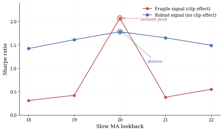
Same optimum. Opposite stories.
The red line is the trap. Sharpe 2.07 at lookback 20, but 0.42 at 19 and 0.38 at 21. If you stop at “Sharpe 2 on lookback 20”, you have learned nothing about the market. You have learned that a specific number aligned with a specific sequence of trades. Move one step left or right, the alpha is gone.
The blue line is what real structure looks like. Lower peak (1.78), but 1.61 and 1.65 right next to it. The signal exists before, at, and after the optimum.
Compare the peaks in isolation, the red strategy wins. Compare the surfaces, the choice is obvious.
3. Going 2D: the heatmap test
One parameter is rarely enough. Most strategies have at least two: a feature window and a target horizon, two moving averages, a volatility filter and a signal threshold. The proper version of the clip test is a 2D heatmap of Sharpe across the parameter grid.
What you want to see: a connected zone of green, smooth gradients, the optimum sitting inside a region of similar values.
What kills the strategy: scattered green pixels in a sea of red, or a single bright square with nothing around it.
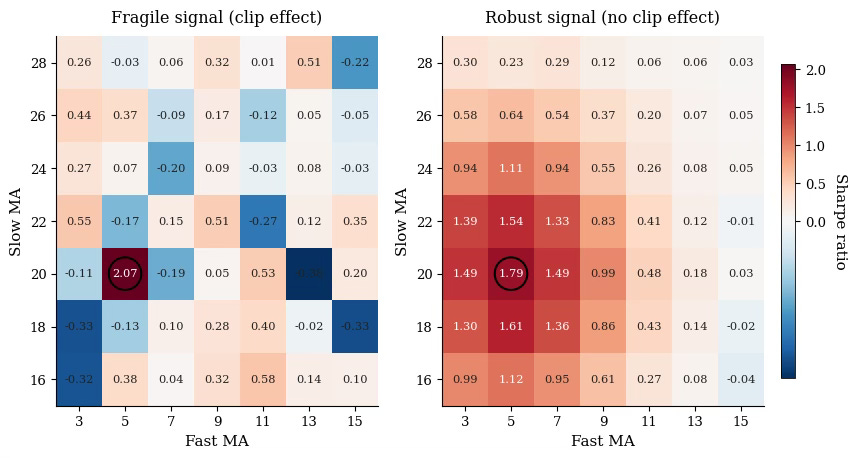
In 2D, the eye does the work. With five parameters and ten possible slices, you need a quantitative metric: average Sharpe in the ±1 neighborhood, peak-to-mean ratio, or fraction of the grid above a threshold. Visualization is a starting point, not the test itself.
4. The practical rule
Before you trust any optimum, ask one question:
Does Sharpe degrade by more than 30 to 40% when I move ±1 on each parameter?
If yes, drop the strategy. If no, you have passed the first filter, not the last one.
The clip test will not save you from every form of overfitting. Scanning 50 parameter pairs and selecting the best plateau is still cherry picking, just better dressed. But this is the cheapest, most visual robustness check you can run, and it kills the majority of bad backtests in seconds.
Run it on every strategy you build. You will discard more than you keep.
That is the point.
→ Speaking of robustness, the next bottleneck most retail quants hit is data. Next week I am opening up Quantlake, the program I have been building on creating quant database for 0$: weather, crypto alt-data, CFD, spot markets. Stay tuned!